Exploring the Weird World of IPUMS Data Availability
The IPUMS data products aim to make comparison of census and survey data across time and nations as easy as possible. The first step in effectively using IPUMS is to discover data that’s available for the time and place you’re interested in studying. The IPUMS data request websites’ goal is to give users an efficient method for finding and requesting data from IPUMS.
“Efficiently finding data” presents some interesting user interface challenges when it comes to IPUMS. In the rest of this article we’ll take a visual, high-level view of the IPUMS metadata that drives the data request system and underpins our data integration process.
To start with, we’ll focus on the U.S. Census (IPUMS USA) since most of us have some familiarity with a national census, but the discussion also applies to other IPUMS data drawn from health and employment surveys.
Why Data Discovery is Not Dead Simple
In a perfect world the U.S. Census Bureau would have asked every possible question of every person since the very first census and the questions would always have had the same range of responses.
In that utopian world, everyone would have happily responded to the lengthy questioning and census-takers would all have behaved exactly the same, making no mistakes, and would have displayed perfect penmanship and consistent spelling.
In the real world, however, we must build IPUMS with the census and survey data we actually have. You can request a customized IPUMS extract from our site by requesting the original datasets (census or survey year) and variables (questions) you’d like to include in your IPUMS extract. In a perfect world, you could select what you wanted from a simple list of datasets and another simple list of variables. Unfortunately, not all questions were asked in every year, which complicates the data discovery process.
The U.S. Census changed throughout the history of the nation. Some questions got dropped, while others were added. The census also had two versions – a long form and a short form – for many decades, and most people would get the short form while a smaller subset will get the long form. The long form had many more questions, which meant that for some questions, there were far fewer respondents than for other. In 2001, the U.S. Census Bureau introduced the American Community Survey as a more detailed survey that goes to about 3.5 million households annually. As a result, the Bureau dropped the long form as of the 2010 census.
Because of these changes in the U.S. Census over time, if IPUMS took the naive approach to requesting data – simply picking and choosing what you wanted from static lists of datasets and questions – then the resulting dataset would have lots of missing data in years where a chosen question was not asked.
Users could resort to reading documentation on each census question before requesting it, to learn if it was asked in every year they want in their analysis. That could take a lot of time.
Let’s imagine you want to study the relationship between home values and time spent commuting to work. You discover the IPUMS “VALUEH” variable (home value.) And you find the “TRANTIME” variable (“travel time to work one-way.) So this looks promising. “TRANTIME” was first asked in 1960, while VALUEH was in the Census in 1930, 1940, not in 1950, then again every census since 1960. That’s good to know - now we’ve determined that for this research question, the data is fully available since 1960.
A more difficult example: Say you learn about the “DURMARR” variable (Duration of marriage.) You can study qualities of long-married people with this. Are their homes worth more than briefly married people of the same ages (probably?) Anyway you proceed to request “VALUEH”, “DURMARR” and “AGE”. Unfortunately you’ll discover “DURMARR” only exists in 1900, 1910 and 1950, all decades when “VALUEH” wasn’t asked.
Finding Only Data That Exists - the Availability Grid
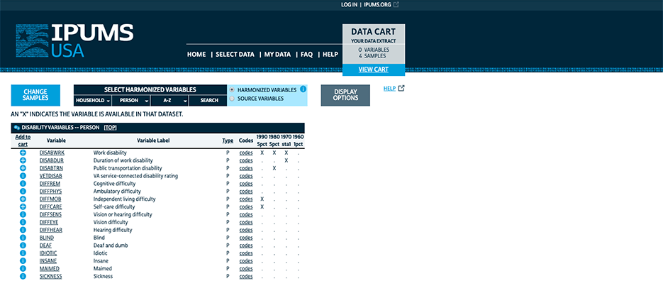
To simplify this “data availability exploration” process, we present a construct called an “availability grid” on our websites when users are selecting data. The grid shows the cross-product of choosable variables from within a selected topic group by chosen datasets (or all datasets if none have yet been chosen.) We mark every cell in the grid – every variable-dataset combination – as available or not available.
This way, users know ahead of time if their desired question was asked in a particular year. The horizontal axis represents census years, while the vertical is variables. Users can then scan a column to know what variables exist in a given year, and a row to see in which years a particular variable exists.
Screenshot of an availability grid with a few samples and variables
The data availability grid is foundational to the whole IPUMS concept. Integrating data across time and countries is an imperfect business. We make available data as comparable as possible but we can’t conjure comparable answers out of thin air* (*Except when we do. We impute some variables when we have enough other information to allow it. See IMPREL.)
I mentioned that the data availability grid is foundational to IPUMS, and indeed it manifests itself not just within the web UI but at several points of the IPUMS data pipeline, starting at the data integration step, continuing through the modeling of the metadata driving the website and data extract engines, and ending in the UI for selecting data.
Navigating Available Data
So far, so good - the availability grid approach has definitely proven its value over many years now. But what if you need to look at a large set of years and variables simultaneously? The grid approach, in a literal sense, does not scale:
Screenshot of a full availability grid
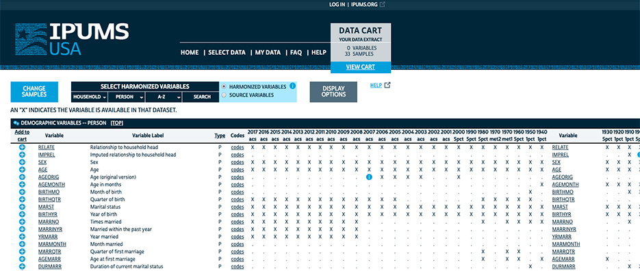
The x-axis extends far to the right of even the largest screen and you can scroll down for page after page to see all of the variables.
Other IPUMS data products have the additional difficulty that they contain many more questions than the U.S. Census, and sometimes many more datasets as well. So the dimensions of this style of grid can get out of hand very easily and a one-size-fits-all solution is hard to find. It makes for an interesting user interface design challenge.
We encourage users to select a small set of datasets (“samples”) up-front to limit the width of the x-axis. To limit the size of the y-axis we guide the user to view subsets of variables grouped by topics or alphabetically. For products with many more variables or datasets than IPUMS USA we make more variable topic groups and make dataset selection easier. For instance IPUMS CPS, with nearly six hundred datasets, has the Rotation Pattern Explorer tool to help users navigate its many datasets.
The rise of mobile computing with much smaller screen sizes makes the limitations of the grid approach even more acute. Due to the screen real estate limitations, the IPUMS Abacus mobile real-time tabulation app had to dispense with a grid altogether and rely on a dynamic, interactive data selection approach: users choose a year and immediately all topics and variables narrow down to what’s available for that year. If users choose a topic and variable first, the choices of years narrow accordingly as well. The dynamic feedback loop actually makes exploring what’s possible to tabulate more efficient than the grid approach. It’s an elegant solution, especially when few variables and years are involved.
Screenshot of IPUMS Abacus showing variables available for the 1940 Census sample
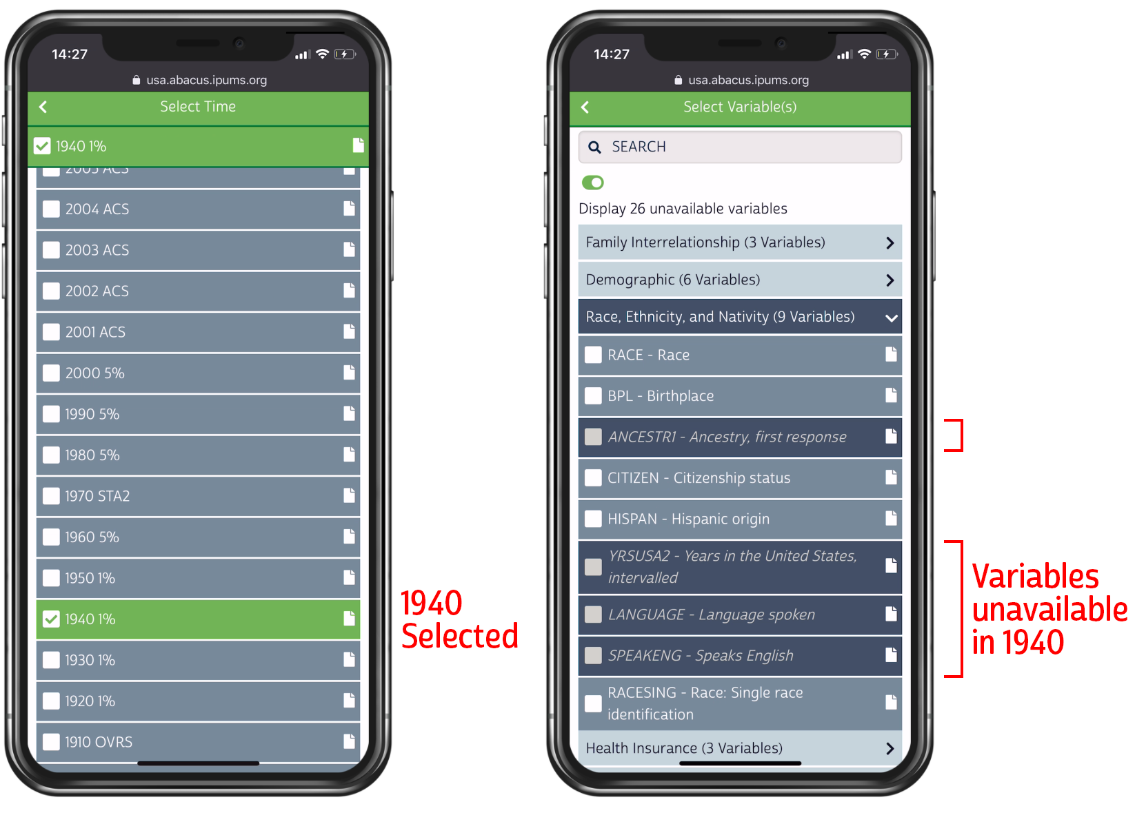
This “dynamic narrowing” approach could be confusing if a user could select dozens of variables or years at once, potentially missing exactly which year or variable choice it was that may have dramatically reduced their choices in the other dimension. Fortunately for Abacus, tabulation naturally limits itself to a few variables and datasets at a time, so the effect of each choice on the other dimension is evident.
Visualizing IPUMS Data Availability
Let’s now take a bird’s-eye view of variable availability across all years for all variables in IPUMS-USA (U.S. Census data). In this graph, the x-axis is time and the y-axis is variables, sorted by their variable group (topic).
IPUMS-USA Data availability Grid
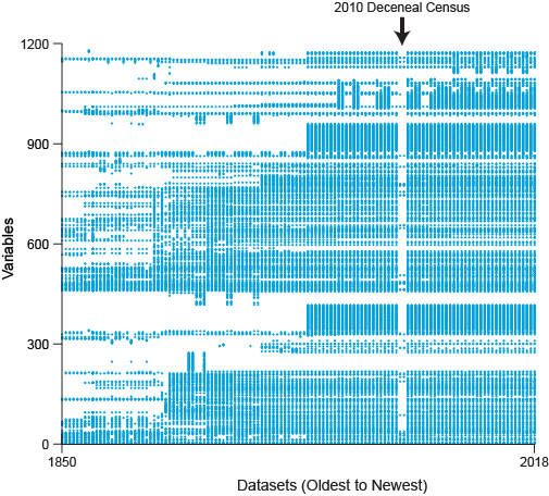
The dark spots show where data is available. You see many gaps, with availability generally increasing over time as automation of the Census took hold and more questions could be asked or inferred every year.
The right-hand side has more coverage because since 2001 we include the annual ACS (American Community Survey) data, which contains many more questions than the Census.
The vertical gap towards the right-hand side represents the 2010 decennial Census, which had only a handful of questions and no long form. If you’re wondering why it takes up two vertical spaces instead of one, that’s because the Puerto Rico and U.S. states Censuses are considered separate datasets.
The grid has too many points to actually label them; you’d need a software “microscope” to navigate this grid directly, zooming in on topics of interest and plucking records from the pile near your area of interest. You could imagine a third dimension representing available cases (number of people responding to this question) or total categories (possible answers to a question). You could imagine turning the graph ninety degrees on its back so that the most recent data lives on the “surface” of the graph, and to go back in time you’d “dive” down into the graph instead of moving left along the x-axis.
Visualizing data like this is the closest thing I can think of to William Gibson’s description of wandering through a giant corporate database in Cyberspace:
Cyberspace. A consensual hallucination experienced daily by billions of legitimate operators, in every nation, by children being taught mathematical concepts… A graphic representation of data abstracted from banks of every computer in the human system. Unthinkable complexity. Lines of light ranged in the nonspace of the mind, clusters and constellations of data. Like city lights, receding…
William Gibson
Okay, maybe I shouldn’t get too excited.
Let’s look at how some other data products can be visualized in this way:
The IPUMS-International availability Grid
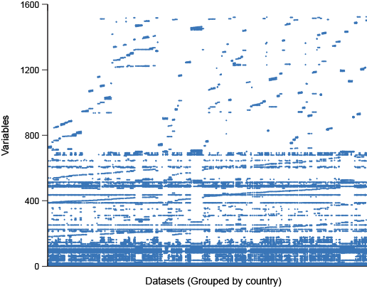
Here we see a fairly well populated bottom half of the grid with the top-half being quite sparse. Why? It’s because the top half represents country-specific questions which mirror the original census questions from each country, sometimes uniquely from each year, and each of these questions are represented as a unique variable in our metadata model. While these country-specific variables aren’t very “integrated” in the IPUMS sense, they are quite useful, so we compromise on the amount of integration required to be in the IPUMSI data, keeping a core of widely comparable variables while still making country-specific data easily available.
Now look at this IPUMS Higher Ed survey data:
The Higher-Ed Survey Data availability Grid
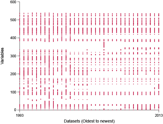
Here we have a much smaller number of datasets and variables, and the survey appears to be quite consistent across time, which makes sense since this survey was designed to measure the same things each time it was taken, and there aren’t many years in which the survey might have changed.
On the other hand:
NHIS Health Interview Data availability Grid
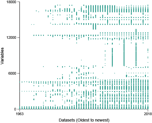
The NHIS health survey has had a vast number of questions asked every year since 1963. Some of these years had supplemental questionnaires, which consequently causes that year’s variable count to balloon.
Conclusion
The diagrams you’ve just seen give you a macro view of the diversity of the landscape of variable-dataset availability that the IPUMS extract system is designed to navigate. To provide for effective data discovery, we employ a combination of interactive user interface approaches along with robust documentation to help users navigate the available data.
Authored by Colin Davis
Data · Visualization
IPUMS UX