Several recent posts have introduced techniques for integrating spatial data sources with PMA survey data. We’ve explored precipitation patterns in Burkina Faso using terra, considered the evolution of conflict areas in Uganda from 2019-2020, and created multi-country faceted maps using cowplot.
In each of these cases, we’ve relied on the familiar ggplot2 and ggspatial packages
as our cartographic workhorses. ggplot2 can be a powerful
tool when making maps, and its standardized syntax for both spatial and
non-spatial data visualization is appealing, but in practice it is best
for producing static maps.
In many — probably most — cases, a static map is all that we need to display the spatial patterns present in our data, but there are situations in which it can be beneficial to be able to interact with the map directly. Interactivity is often thought of as a feature to be employed in a final visualization product, but it can be extremely useful during data exploration, as well.
By allowing the reader to click to receive specific information about certain spatial features, zoom and pan to see both macro- and micro-level patterns, toggle between different metrics, and more, interactive maps can make it easier to:
- Familiarize oneself with a new spatial data source
- Conduct quality assurance to ensure that spatial computations are behaving as might be expected
- Visualize variables that show a broad range of spatial variation. (For example, some areas may have a high density of features, while other areas have no features at all.)
- Generate new hypotheses or research questions based on initial exploration of the spatial distribution of a variable
- Compare different operational definitions of a spatial variable of interest
In this post, we’ll use the leaflet package to explore the spatial distribution of two competing metrics for urbanism using PMA panel data from Kenya. IPUMS PMA has a variable indicating whether an enumeration area is urban or rural (URBAN), but the definition of this variable is not well-standardized across countries, so an external data source may provide a more reliable indication of urbanism.
The leaflet package provides an R interface with the leaflet.js JavaScript library. While
not all of the functionality available in the JavaScript version is
available in R, the package makes it surprisingly easy to quickly
assemble professional-quality interactive maps for data exploration and
presentation.
Setup
To showcase the advantages of interactive maps, we’ll use the variable PANELBIRTH, which indicates whether a woman gave birth in the year between Phase 1 and Phase 2 of the Kenya panel study. As you might imagine, PMA surveys already contain a number of key predictors for childbirth. We’ll feature only a few variables representing each woman’s
As we’ll see, an interactive map allows the user to zoom-in on each PMA sample cluster - known as an enumeration area (EA) - and dynamically render a summary table for the average age, marital status, and wealth of reproductive age women in that specific location.
Mapping also allows us to examine the relationship between PMA
variables and data from external sources. We mentioned above that IPUMS
PMA includes the variable URBAN, which indicates whether
each country’s statistical bureau classifies a woman’s EA as “urban” or
“rural”. Because this definition varies by country, PMA researchers like
Zhang (2022) sometimes
use road network density as a standardized proxy for urbanism. To
demonstrate, we’ll obtain road network data from Geofabrik and plot local road
density together with PMA summary data for each EA.
To get started, we’ll load the following packages in R. (If you haven’t installed all of these yet, you can do so with install.packages first.)
Next, we’ll obtain a long-format longitudinal extract with members of the Kenya panel study (Female Respondents only). To keep things simple, we’ll filter to include only records from the Phase 2 interview.1
dat <- read_ipums_micro(
ddi = "data/pma_00149.xml",
data = "data/pma_00149.dat.gz"
)
dat <- dat %>% filter(YEAR == 2020 & RESULTFQ == 1)
We’ve mentioned previously on this blog that researchers must apply with PMA to access the GPS coordinates for each EA. These GPS data come in the form of a CSV file of displaced centroid points in latitude/longitude format. The PMA documentation goes into more detail about this displacement methodology. For our purposes, it is enough to keep in mind that the point locations in our GPS data are approximate: they represent the center of each sample cluster, but this center is randomly displaced up to 10 kilometers in order to further protect participant confidentiality.
The GPS data come in CSV format, which we’ll load into R with read_csv.
We’ll then use the sf
package to convert the imported data into an sf spatial
object, which will use the coordinate reference system
WGS 84.2 We can pass EPSG code 4326 to st_set_crs
to indicate that our coordinates are relative to the WGS 84 system.
Now that we have our PMA data and EA coordinates prepared, we can
start working with leaflet itself.
Introduction to Leaflet
For those familiar with ggplot2, the conceptual
framework when building a leaflet map should be fairly
familiar. In both cases, we’ll construct our final visual product in a
series of layers, which will be superimposed to form the final
output.
Accordingly, when we initialize a leaflet map with its
eponymous function, leaflet, we see
only a blank gray canvas, just like we might expect with
ggplot2:
leaflet()
As with ggplot, the leaflet function allows
you to attach data and set several other map-wide parameters.
At its core, though, calling leaflet is enough to get a
map going.
Basemaps
Most web basemaps rely on a set of square tiles that can be stitched
together to form an entire map. This improves processing since only the
new tiles in the region being viewed need to be downloaded as the user
pans or zooms. leaflet has several built-in basemaps, which
can be added with addProviderTiles.
Available map providers can be accessed using providers.
For our maps, we’ll use the Positron tiles from Carto. These understated basemap tiles are well-suited for emphasizing our data, which we will overlay later.
leaflet() %>%
addProviderTiles(providers$CartoDB.PositronNoLabels)
We can set some initial parameters using the options
argument in addProviderTiles. This argument itself takes a
function, providerTileOptions,
whose arguments correspond to several of the options available for
standard JavaScript leaflet maps. Here, we set the minimum
and maximum zoom range for the map. We then use the setView
function to initialize the map over our area of interest with an
appropriate zoom level.
basemap <- leaflet() %>%
addProviderTiles(
provider = providers$CartoDB.PositronNoLabels,
options = providerTileOptions(minZoom = 6, maxZoom = 12),
) %>%
setView(lat = -0.06, lng = 37.48, zoom = 7)
basemap
Adding Spatial Features
Even though our basemap shows up-to-date borders from OpenStreetMap, it would be nice to emphasize Kenya’s administrative regions to draw the viewer’s attention to our area of interest. We load a shapefile of Kenya’s administrative borders for use in our maps:
borders_sub <- st_read("data/ke_boundaries/ke_boundaries.shp")
To get a border for the entire country, we can dissolve the internal administrative region borders to the external border with st_union:
Just like with ggplot2, leaflet has a
variety of similar layer types,
each of which is specific to the types of spatial features being mapped.
For instance, data of point locations call for the use of
addCircles or addCircleMarkers, whereas data
of polygon areas would require addPolygons.
Each of these functions anticipates a map object as its
first argument. This makes leaflet maps respond well to the
pipe syntax you may be familiar with from data manipulation in the
tidyverse, since each of these functions also
returns a map object. The only difference is that
instead of piping data through each step in the processing pipeline,
we’re piping our map.
So, to add both our borders and our EA coordinates to the map, we
simply have to pipe our basemap into a call to addPolygons
where we specify that the data associated with this map layer come from
our borders_sub object. Then we can pipe this output
directly into a call to addCircleMarkers, adding the EA
points to the map. The other function arguments, like
fillColor, opacity, and so on, control the
aesthetics of these layers.
basemap %>%
addPolygons(
data = borders_sub,
fill = NA,
opacity = 0.8,
weight = 2,
color = "#9D9D9D"
) %>%
addCircleMarkers(
data = ea_coords,
radius = 4,
fillColor = "#575757",
fillOpacity = 0.8,
color = "#1D1D1D",
opacity = 0,
weight = 1.5
)
As we can see, all of the EAs fall into a few specific administrative regions, reflecting the regions that were included in the 2019 survey. And one of the advantages of the interactive map is already becoming apparent: while the western portions of the map are too dense with EAs to adequately see their distribution, we can easily zoom in to get a better sense of their layout. In our case, we expect this clustered distribution of EAs, but with less-familiar data sources, these types of observations might lead to important questions about the quality and collection mechanism of the data being used.
Road Network Metrics
Now that we’ve mapped the centroid of each EA, we’re ready to begin
work on a road network measure that classifies each EA as either “urban”
or “rural”. Because leaflet allows readers to
toggle between layers in real-time, we’ll consider two
metrics in turn:
- distance from the EA centroid to the nearest road
- road density near the EA centroid
Researchers may disagree about which metric works best as a proxy for urbanism in this context, but the interactive features built into our map could allow readers to compare potentially several measures at once. The tools shown here could also showcase layers for landcover, population density, light pollution, and much more.
Obtaining Data
First, we need to obtain data on the Kenyan road network. We will use OpenStreetMap, which is a publicly available, crowdsourced geospatial database covering the entire globe. There are several ways to access OpenStreetMap data. We’ve downloaded road network data for Kenya from Geofabrik, which distributes OpenStreetMap data in manageable region-specific chunks.
To access the data we are using for this post, click here to go to the download page for Kenya and download the “kenya-latest-free.shp.zip” file.
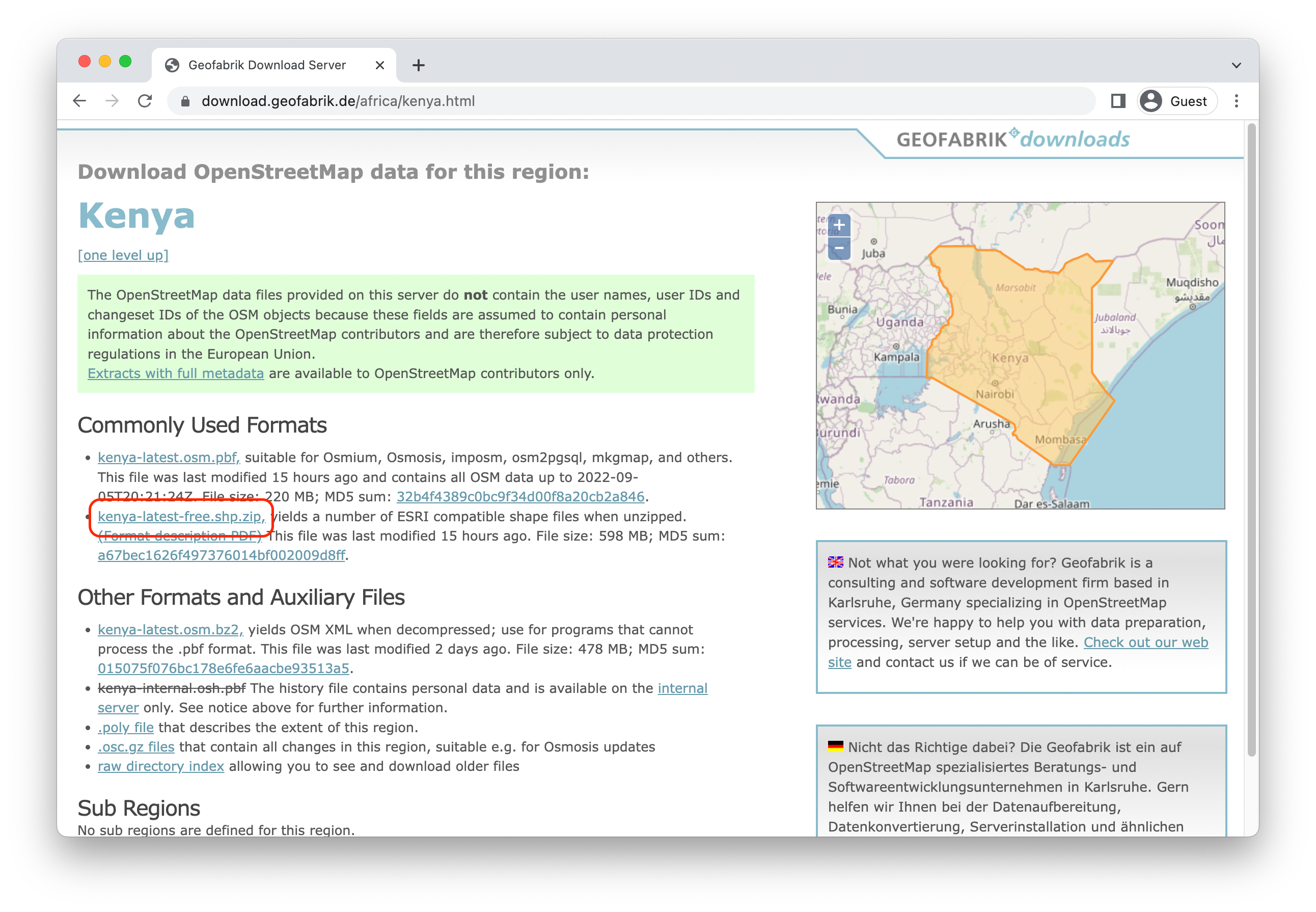
This file will include several different ESRI shapefiles; we are using “gis_osm_roads_free_1.shp”. To improve processing for this brief demo, we restrict our focus to the 6 principal road categories used in the OpenStreetMap classification scheme, which greatly thins out the number of features present in the road network shapefile.
Before we continue, we need to project the road network to a CRS that is better suited for working with spatial distance calculations. Latitude/longitude data are insufficient for this purpose because the distance between degrees of latitude or longitude varies at different points on the Earth’s surface.
While the most accurate method of calculating distances between points is the geodesic distance, which takes into account the three-dimensional nature of the Earth’s surface, this method is often more computationally intensive than alternatives. Since we’re focusing on visualization rather than rigorous analysis in this post, we’ll opt to calculate simpler Euclidean distances, requiring that we convert our data to a Cartesian (X/Y) coordinate system.
One of the most common projected reference systems is the Universal Transverse Mercator (UTM). The UTM is a common map projection system that divides the Earth into 60 projection zones. Each zone runs in a north/south band. While map projects inherently introduce distortion, the narrow bands used by the UTM help to reduce these inaccuracies provided that the area under consideration roughly fits into one of these bands. Fortunately, Kenya is almost entirely contained within UTM Zone 37N, which has the EPSG code 20137.
We can use st_transform to project the road data into this new CRS. You’ll notice that our data are now represented in meters, rather than in degrees:
ke_roads <- st_transform(ke_roads, "epsg:20137")
ke_roads %>% select(geometry)
Simple feature collection with 129131 features and 0 fields
Geometry type: LINESTRING
Dimension: XY
Bounding box: xmin: -67446.75 ymin: -523095.5 xmax: 841462.4 ymax: 584378.8
Projected CRS: Adindan / UTM zone 37N
First 10 features:
geometry
1 LINESTRING (267847.7 -14892...
2 LINESTRING (252816.8 -14401...
3 LINESTRING (255587 -142503,...
4 LINESTRING (256616.2 -14258...
5 LINESTRING (256247.1 -14283...
6 LINESTRING (255393.3 -14348...
7 LINESTRING (257017.9 -14252...
8 LINESTRING (256227.3 -14286...
9 LINESTRING (255454.1 -14376...
10 LINESTRING (253121.6 -14399...Road Distance
Now that the road network data are prepared, we can use
sf to calculate the distances of each EA centroid to its
nearest road.
First, we’ll have to project ea_coords into UTM 37N
coordinates to match the CRS of our road data:
ea_coords <- st_transform(ea_coords, "epsg:20137")
Now we can use st_nearest_feature
to identify the index of the nearest feature in ke_roads
for each EA centroid. Because st_nearest_feature returns
the row index of the nearest road in ke_roads, we can
subset the ke_roads data to extract only those features
that are closest to at least one of the EA centroids.
ea_nearest_rds <- ke_roads[st_nearest_feature(ea_coords, ke_roads), ]
Finally, we use st_distance
to calculate the distance from each of the EA centroids to its nearest
road. This produces a point layer of EA centroids where each EA has a
calculated distance stored in the DIST variable.
ea_dist <- ea_coords %>%
mutate(
DIST = ea_coords %>%
st_distance(ea_nearest_rds, by_element = TRUE) %>%
as.numeric / 1000 # Get units in km.
)
Now we have the data we need to visualize the distribution of road distances across the EAs.
Mapping EAs
To start, we’ll demonstrate how to assign a color gradient to the EA
circle markers shown in grey on our map above. This time, we’ll use
color to represent the DIST variable we created in
ea_dist. With leaflet, we’ll have to create a
palette function that specifies which values should be mapped to which
colors on the scale. You can use one of several built-in palette
generators to facilitate the creation of different types of color
palettes:
colorNumeric: Map continuous values to colorscolorBin: Map continuous values to colors, but group them into binned categories by valuecolorQuantile: Map continuous values to colors, but group them into binned categories by quantilecolorFactor: Map discrete values to colors
Each of these functions takes a palette argument, which
takes a vector of colors or the name of an available palette (e.g. a
palette provided by RColorBrewer
or viridis), and a
domain argument, which indicates the domain of all data
values that should be mapped to the interpolated colors in the provided
palette.
In our case, we use the colorspace package to create a vector of colors from its “Blue-Yellow” palette, and we provide the entire range of distance values calculated in the previous step as the domain.
pal <- colorBin(
colorspace::sequential_hcl(10, "Blue-Yellow", rev = TRUE),
domain = ea_dist$DIST
)
This pal variable is actually a
function — one that maps data values to color values.
So, to use the palette for the fill color of our grid cells, we pass the
data values of the cells (DIST) into our pal
using the ~ syntax to indicate that the
fillColor is a function of our data, not a
static value.
Since we’re adding colors, we’ll also create a legend with addLegend
using the pal function we made above.
We’ll also return ea_dist to its original WGS 84
projection, overriding the default Web Mercator projection used in
leaflet by default.3
basemap %>%
addPolygons(
data = borders_sub,
fill = NA,
opacity = 0.8,
weight = 2,
color = "#9D9D9D"
) %>%
addCircleMarkers(
data = st_transform(ea_dist, "epsg:4326"),
radius = 6,
fillColor = ~pal(DIST),
fillOpacity = 0.8,
color = "#6F6F6F",
weight = 1.5
) %>%
addLegend(
title = "Distance to Nearest Road (km)",
position = "bottomright",
pal = pal,
values = ea_dist$DIST
)
At first glance, it doesn’t look like there is much variability in road distance across our enumeration areas. Most of the areas appear to be within a single kilometer of their nearest road. However, because our EAs are not evenly distributed across the country, we’re lacking in some context. That is, we have no indication of how far someone would need to travel to the nearest road in areas of the country where there aren’t any EAs in this survey, and this could be giving us a distorted view of how outlying the high-distance EAs really are.
Grid Layer
To solve this problem, we’ll create a new layer on our map that shows
the distance to the nearest road on a grid spanning the
complete land area for Kenya. That is: rather than coloring the circle
markers for each EA, we’ll situate grey circle markers on a layer
showing the spatial variance of road distances throughout the country.
This grid will be comprised of hexagonal cells built with st_make_grid,
and fitted to the national border in borders_cntry with st_filter:
Let’s take a look at the grid we’ve created so far:
basemap %>%
addPolygons(
data = hex_grid,
fill = NA,
opacity = 0.8,
weight = 2,
color = "#9D9D9D"
)
Next, we’ll proceed as we did earlier, except that we’ll find the distance to the nearest road from the centroid of each hexagonal cell rather than the centroid of each EA. To find each centroid, we’ll use st_centroid.
hex_grid <- hex_grid %>% st_transform("epsg:20137")
hex_ctrs <- st_centroid(hex_grid)
hex_nearest_rds <- ke_roads[st_nearest_feature(hex_ctrs, ke_roads), ]
hex_grid <- hex_grid %>%
mutate(
DIST = hex_ctrs %>%
st_distance(hex_nearest_rds, by_element = TRUE) %>%
as.numeric / 1000 # Get units in km.
)
We’ll need to update the domain in our palette function,
since it currently only captures the range of distances for our EAs,
which will be a subset of the total range of distances across the new
grid layer.
pal <- colorBin(
colorspace::sequential_hcl(10, "Blue-Yellow", rev = TRUE),
domain = hex_grid$DIST
)
We’ll now use pal to color each of the grid cells, and
then we’ll add layers for sub-national borders and EA circle markers as
we did before. Lastly, we’ll update addLegend to span the
range of values in our new grid layer.
basemap %>%
addPolygons(
data = hex_grid %>% st_transform("epsg:4326"),
fillColor = ~pal(DIST),
color = "#fefefe",
fillOpacity = 0.5,
weight = 1,
group = "Road Distance"
) %>%
addPolygons(
data = borders_sub,
fill = NA,
opacity = 0.8,
weight = 2,
color = "#9D9D9D"
) %>%
addCircleMarkers(
data = ea_coords %>% st_transform("epsg:4326"),
radius = 4,
fillColor = "#575757",
fillOpacity = 0.8,
color = "#1D1D1D",
opacity = 0,
weight = 1.5
) %>%
addLegend(
title = "Distance to Nearest Road (km)",
position = "bottomright",
pal = pal,
values = hex_grid$DIST
)
This country-wide map shows us what we suspected earlier: while the most remote EAs were only about 3 kilometers from the nearest road, the entire range of road distances spans all the way to roughly 40 kilometers in some places. In fact, all of the EAs would fall into the lowest binned color class using the full range of distance values!
Of course, this may not be a true cause for concern. Areas of high distance might also have few inhabitants, making those regions someone less representative of the bulk of the population. Similarly, depending on the research questions of interest, it may well be the case that the difference between a 500m distance and 1km distance is conceptually meaningful, even though it composes only a tiny fraction of the overall range of possible road distances.
However, it might also be the case that the distance from the nearest road simply isn’t a very useful measure of urbanism. Even though we aren’t using residential roads or other minor road classes recorded in the OpenStreetMap data, a sufficiently comprehensive road network database would probably suggest that most EAs are very close to some type of road.
Instead of road distance, it might make more sense to calculate road density. Even EAs that are fairly close to some road may not be in an area that has a dense network of roads.
Road Density
To calculate the road density from our ke_roads data,
we’ll use the spatstat package, which
provides a collection of point pattern analysis tools. First, we’ll
convert our ke_roads object to a psp
object. This is a class that spatstat uses to represent
line segment data.
We can then use the density.psp
function to calculate the density of our road network and convert to a
more familiar SpatRaster
object from the terra package.
In a true analysis, it would be worth spending time to identify an
appropriate value for the standard deviation parameter
sigma and the pixel resolution eps, but the
following should do for our purposes:
ke_roads_dens <- ke_roads %>%
st_geometry() %>%
as.psp() %>%
density.psp(sigma = 5000, eps = 2000) %>%
rast()
crs(ke_roads_dens) <- "epsg:20137"
We could go ahead and map our raster object directly. However, for better visual comparison with our previous gridded map, we’ll convert the raster to a hexagonal grid, so we use extract to get the mean density values within each hexagon.
Our Road Density map will closely resemble our previous Road Distance map, so we’ll want to be sure to create a distinctive color palette for each to help readers tell the two metrics apart. This time, we’ll use a red / orange palette.
pal <- colorNumeric(
colorspace::sequential_hcl(10, "OrRd", rev = TRUE), # substitute "OrRd"
domain = hex_grid$DENS # substitute "DENS"
)
We can use the same code for our new Road Density map, except that
we’ll need to make several substitutions for the new variable
DENS and for our legend (which we’ll now show at the
bottom-left).
basemap %>%
addPolygons(
data = hex_grid %>% st_transform("epsg:4326"),
fillColor = ~pal(DENS), # substitute "DENS"
color = "#fefefe",
fillOpacity = 0.5,
weight = 1,
group = "Road Density" # substitute "Road Density"
) %>%
addPolygons(
data = borders_sub,
fill = NA,
opacity = 0.8,
weight = 2,
color = "#9D9D9D"
) %>%
addCircleMarkers(
data = ea_coords %>% st_transform("epsg:4326"),
radius = 4,
fillColor = "#575757",
fillOpacity = 0.8,
color = "#1D1D1D",
opacity = 0,
weight = 1.5
) %>%
addLegend(
title = "Desnity of road network", # new legend title
position = "bottomleft", # new legend position
pal = pal,
values = hex_grid$DENS # substitute "DENS"
)
Compared with our previous map, we see that there appears to be more variation in road density across our EAs, a potential sign that this metric may capture a wider spectrum of urbanism. Of course, this is a relatively simple density calculation, and a more sophisticated approach might take into account the different types of roads present in the network and adjust for the fact that the road density will inherently decrease along coastlines, and so on.
Of course, we want to avoid asking our reader to compare maps by scrolling upward and downward on this page! To make this comparison easier to see, we’ll now demonstrate how to combine the two metrics on a single map that allows the reader to switch between metrics of interest.
Layer Toggle
In our combined map, we’ll have 2 grid layers - each showing a different road network metric. We’ll introduce a toggle at the top-right corner of our map allowing the user to choose between Road Distance and Road Density.
Remember: in addition to both of the grid layers, we’re also mapping
layers for sub-national borders and the location of each EA. With so
many layers in-play, we’ll want to control the order in which each one
is plotted on top of the next. To do so, we’ll use addMapPane to
create a name and zIndex for each layer: a
zIndex value should typically fall between 400 (the default
overlay pane) and 500 (the default shadow pane). Let’s update
basemap to include the following “map panes”:
Hexfor the hexagonal grid layers,Bordersfor the sub-national bordersEAsfor the EA centroid locations
basemap <- basemap %>%
addMapPane("Hex", zIndex = 430) %>%
addMapPane("Borders", zIndex = 450) %>%
addMapPane("EAs", zIndex = 500)
Next, we’ll start building the layers that will comprise our new map,
which we’ll call toggle_map. First, we’ll recycle code from
the sections above to plot the Borders and
EAs. The options argument allows us to assign
a “map pane” for each.
toggle_map <- basemap %>%
addPolygons(
data = borders_sub,
fill = NA,
opacity = 0.8,
weight = 2,
color = "#9D9D9D",
options = pathOptions(pane = "Borders") # <-------------- New part!
) %>%
addCircleMarkers(
data = ea_coords %>% st_transform("epsg:4326"),
radius = 4,
fillColor = "#575757",
fillOpacity = 0.8,
color = "#1D1D1D",
opacity = 0,
weight = 1.5,
options = pathOptions(pane = "EAs") # <-------------- New part!
)
Next, we’d like to use addPolygons and
addLegend twice each: once for the Road Distance layer, and
once again for the Road Density layer. However, we need to update our
color palette function pal with different colors for each
metric. In this case, it might make sense to write a custom function
that runs addPolygons and addLegend with
changes provided by user input.
This function, which we’ll call add_hex_grid, takes a
unique var (either “DIST” or “DENS”),
legend_title, and legend_position for each
grid layer. We’ll also create one group name for each
layer, which will allow us to toggle between layers with addLayersControl.
add_hex_grid <- function(map, data, var, palette, group,
legend_title, legend_position) {
data <- st_transform(data, "epsg:4326")
pal <- colorNumeric(
colorspace::sequential_hcl(10, palette, rev = TRUE),
domain = data[[var]]
)
map %>%
addPolygons(
data = data,
fillColor = ~pal(data[[var]]),
color = "#fefefe",
fillOpacity = 0.7,
weight = 1,
group = group,
options = pathOptions(pane = "Hex")
) %>%
addLegend(
title = legend_title,
position = legend_position,
pal = pal,
values = data[[var]]
)
}
Now, we’ll use add_hex_grid once for each grid layer,
followed by addLayersControl to toggle between them.
toggle_map %>%
add_hex_grid(
data = hex_grid,
palette = "Blue-Yellow",
var = "DIST",
legend_title = "Distance to nearest road (km)",
legend_position = "bottomright",
group = "Road Distance"
) %>%
add_hex_grid(
data = hex_grid,
palette = "OrRd",
var = "DENS",
legend_title = "Density of road network",
legend_position = "bottomleft",
group = "Road Density"
) %>%
addLayersControl(
baseGroups = c("Road Distance", "Road Density"),
options = layersControlOptions(collapsed = FALSE)
)