In our last post, we showed how PMA Service Delivery Point (SDP) data can be aggregated to the enumeration area they serve (captured by EASERVED) and linked to individual-level data from a PMA Household and Female survey. In this post, we’ll continue thinking about the spatial distribution of SDP summary data. We’ll first show how to merge our example data to a GPS dataset obtained from pmadata.org, and we’ll then use the new dataset to visualize a few of our variables on a map of Burkina Faso.
Data
Building on the steps we’ve covered in the last two posts in this series, we’ll be working with an example dataset we’re calling bf_merged that contains records from female respondents to the 2017 and 2018 Burkina Faso Household and Female surveys merged with five variables we’ve created from the 2017 and 2018 SDP surveys. These five variables describe services provided within the enumeration area where each woman resides:
NUM_METHODS_PROV- number of methods provided by at least one SDPNUM_METHODS_INSTOCK- number of methods in-stock with at least one SDPNUM_METHODS_OUT3MO- number of methods out of stock any time in the last 3 months with at least one SDPMEAN_OUTDAY- the mean length of a stockout for any family planning method (measured in days)N_SDP- number of SDPs
The remaining four variables in bf_merged were taken directly from a data extract containing only female respondents:
- PERSONID - unique identifer for each woman
- EAID - unique identifier for each woman’s enumeration area
- URBAN - whether each woman lives in an urban enumeration area
- FPCURRUSE - whether each woman is currently using any family planning method
We’ll also be working with toy PMA GPS datasets for Burkina Faso. PMA GPS data include one GPS coordinate per enumeration area. The Burkina Faso Round 5 and 6 surveys sampled the same enumeration areas, which means we can link the GPS data to both rounds. To use real PMA GPS data you must request access directly from our partners at pmadata.org. For the purpose of use in this post, we’ve created a “toy” GPS dataset: the toy data contains randomly sampled locations within Burkina Faso that have no actual relationship to the EAs in the PMA data.
The last dataset we’ll use in this post are the administrative boundaries for Burkina Faso. Shapefiles with administrative boundaries are widely available for download, but we’ll use the ones made available from IPUMS PMA.
Setup
Make sure you have all of the following packages installed. Once installed, load the packages we’ll be using today:
If you followed along with our last post, glimpse(bf_merged) should list the first few records for all of the variables we have so far:
glimpse(bf_merged)
Rows: 6,944
Columns: 10
$ EAID                <dbl+lbl> 7003, 7003, 7003, 7003, 7003, 7003,…
$ SAMPLE              <int+lbl> 85405, 85405, 85405, 85405, 85405, …
$ N_SDP               <int> 3, 3, 3, 3, 3, 3, 3, 3, 3, 3, 3, 3, 3, …
$ NUM_METHODS_PROV    <int> 10, 10, 10, 10, 10, 10, 10, 10, 10, 10,…
$ NUM_METHODS_INSTOCK <int> 8, 8, 8, 8, 8, 8, 8, 8, 8, 8, 8, 8, 8, …
$ NUM_METHODS_OUT3MO  <int> 0, 0, 0, 0, 0, 0, 0, 0, 0, 0, 0, 0, 0, …
$ MEAN_OUTDAY         <dbl> NaN, NaN, NaN, NaN, NaN, NaN, NaN, NaN,…
$ PERSONID            <chr> "0700300000019732017504", "070030000001…
$ URBAN               <int+lbl> 0, 0, 0, 0, 0, 0, 0, 0, 0, 0, 0, 0,…
$ FPCURRUSE           <int+lbl> 0, 0, 1, 1, 0, 0, 0, 0, 0, 1, 0, 0,…
Remember that we merged the EA-level data into the individual-level data, but the GPS datasets provide coordinates for the enumeration area. So the first thing we’ll do is aggregate bf_merged to the EA-level, and assign the aggregated data to a new object called bf_ea.
Now, let’s read in the GPS data from the data folder and see what the it contains.
gps <- read_csv("bf_gps_fake.csv")
gps
# A tibble: 83 x 7
   PMACC PMAYEAR REGION               EA_ID DATUM GPSLAT GPSLONG
   <chr>   <dbl> <chr>                <dbl> <chr>  <dbl>   <dbl>
 1 BF       2017 5. centre-nord        7610 WGS84   14.2  0.126
 2 BF       2017 1. boucle-du-mouhoun  7820 WGS84   13.5 -3.08
 3 BF       2017 3. centre             7271 WGS84   12.2  1.43
 4 BF       2017 3. centre             7799 WGS84   12.2 -0.799
 5 BF       2017 8. est                7243 WGS84   11.0 -2.58
 6 BF       2017 6. centre-ouest       7026 WGS84   10.9 -4.35
 7 BF       2017 3. centre             7859 WGS84   12.4  0.0703
 8 BF       2017 3. centre             7725 WGS84   12.7  1.42
 9 BF       2017 6. centre-ouest       7390 WGS84   10.8 -3.55
10 BF       2017 11. plateau-central   7104 WGS84   13.3  0.0957
# … with 73 more rowsThe gps data has 7 variables:
PMACC: the country codePMAYEAR: the 4-digit year of data collectionREGION: sub-national administrative division nameEA_ID: the enumeration area ID (and how we’ll merge this data into other PMA datasets)GPSLAT: the displaced EA’s centroid latitude coordinate in decimal degreesGPSLONG: the displaced EA’s centroid longitude coordinate in decimal degreesDATUM: the coordinate reference system and geographic datum. This variable is always “WGS84” for the World Geodetic System 1984.
Note that the GPSLAT and GPSLONG are displaced coordinates of the EA centroid. This is because PMA randomly displaces the geographic coordinates to preserve the privacy of survey respondents. Coordinates are displaced randomly by both angle and distance. Urban EAs are displaced from their true location up to 2 km. Rural EAs are displaced from their true location up to 5 km. Additionally, a random sample of 1% of rural EAs are displaced up to 10km. The PMA GPS data come with documentation that explains the displacement in more detail. The primary spatial package we’ll use is simple features or sf. We’ll use sf::st_as_sf() to convert the GPS data to a spatial data object (known as a simple feature collection).
gps <- gps %>%
    rename(EAID = EA_ID) %>% # rename to be consistent with other PMA data
    st_as_sf(
      coords = c("GPSLONG", "GPSLAT"),
      crs = 4326) # 4326 is the coordinate reference system (CRS) identifier for WGS84
gps
Simple feature collection with 83 features and 5 fields
geometry type:  POINT
dimension:      XY
bbox:           xmin: -5.185229 ymin: 10.08082 xmax: 1.829187 ymax: 14.93619
geographic CRS: WGS 84
# A tibble: 83 x 6
   PMACC PMAYEAR REGION               EAID DATUM              geometry
 * <chr>   <dbl> <chr>               <dbl> <chr>           <POINT [°]>
 1 BF       2017 5. centre-nord       7610 WGS84  (0.1263576 14.15999)
 2 BF       2017 1. boucle-du-mouho…  7820 WGS84   (-3.075099 13.4676)
 3 BF       2017 3. centre            7271 WGS84   (1.430382 12.17557)
 4 BF       2017 3. centre            7799 WGS84 (-0.7991777 12.22721)
 5 BF       2017 8. est               7243 WGS84  (-2.580105 11.03307)
 6 BF       2017 6. centre-ouest      7026 WGS84  (-4.348525 10.93844)
 7 BF       2017 3. centre            7859 WGS84 (0.07032293 12.44352)
 8 BF       2017 3. centre            7725 WGS84   (1.417154 12.68821)
 9 BF       2017 6. centre-ouest      7390 WGS84  (-3.549929 10.77006)
10 BF       2017 11. plateau-central  7104 WGS84 (0.09573113 13.27184)
# … with 73 more rows
Now that gps is a simple features object, we’ve lost the GPSLAT and GPSLONG variables and gained a variable called geometry, which contains the spatial information for this data.
The last thing we need is the Burkina Faso shapefile, which are available from IPUMS PMA. You’ll need to download the shapefile (geobf.zip) from the IPUMS site and save it in your working directory to use it. We can use sf::st_read() to read the shapefile into R as an sf object. Note that here the geometry variable is a POLYGON, whereas in the gps data it is a POINT.
bf_shp <- st_read("geobf/geobf.shp")
Merge and Map
Now that we have all our data, we’ll show you how to map variables… but before we do that, let’s do some basic, exploratory mapping.
Basic Maps
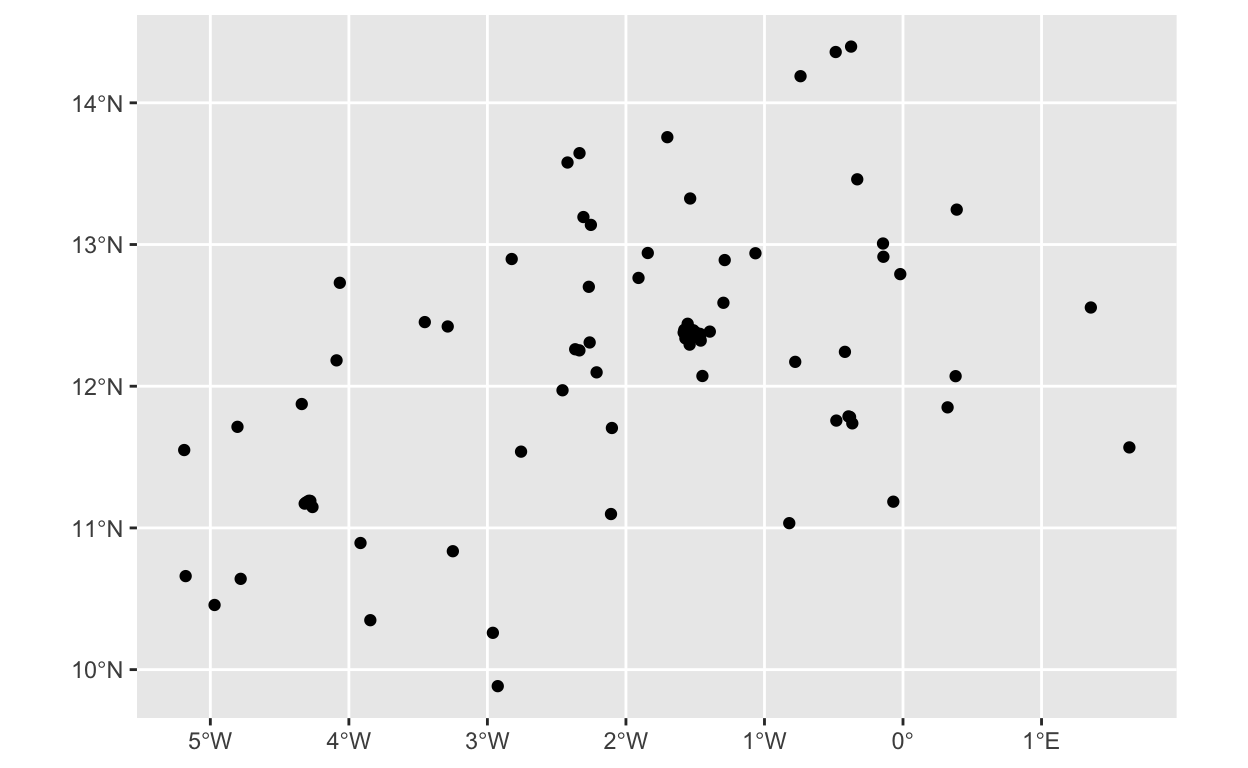
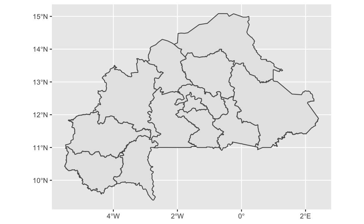
ggplot2 has support for sf objects, which makes it really easy to map things using the ggplot2 system. ggplot2::geom_sf() will automatically identify what kind of spatial data you’re plotting and handle it appropriately. For example, let’s plot the gps data (which are points) and the administrative region (which are polygons).
# Plot EA centroids
ggplot() +
  geom_sf(data = gps)
# Plot regions of Burkina Faso
ggplot() +
  geom_sf(data = bf_shp)
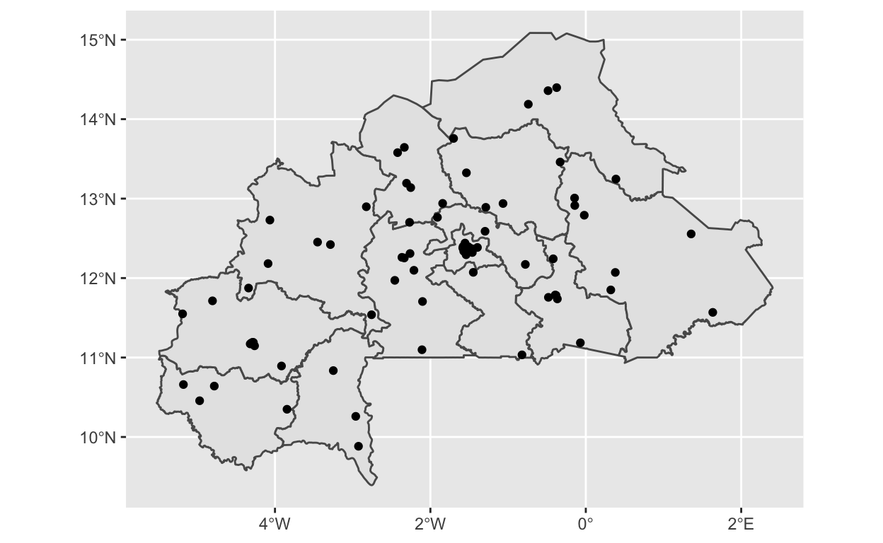
The building-block approach of ggplot2 (“Grammar of Graphics”) also makes it really easy to layer different spatial features on the same map.
# Plot regions of Burkina Faso & EA centroids on the same map
ggplot() +
  geom_sf(data = bf_shp) +
  geom_sf(data = gps)
Merge GPS and SDP Data
To map the EA-level variables constructed in the last post, we need to merge the bf_ea data and the gps data by EAID. First, let’s rename the EASEARVED variable to match the GPS data and then use a dplyr::right_join to merge in the SDP data. We need to use a right_join() because the sf object must be listed first in our join command to retain the sf class, but we want to ensure that all rows from bf_ea are preserved.
bf_ea <- right_join(gps, bf_ea, by = "EAID")
Map SDP data
Remember, the bf_ea data contains information from 2017 & 2018 for the same EA, which can clog up the map depending on how we use this information. To start out, let’s use only the 2017 data and add information about the number of service delivery providers that serve a given EA (N_SDP). By passing N_SDP to the size aesthetic, we can more easily visualize how EAs vary in their access to service delivery providers.
bf_ea2017 <- bf_ea %>%
  filter(SAMPLE == 85405) # this sample corresponds to the 2017 wave

ggplot() +
  geom_sf(data = bf_shp) +
  geom_sf(data = bf_ea2017,
          aes(size = N_SDP),
          alpha = 0.4)
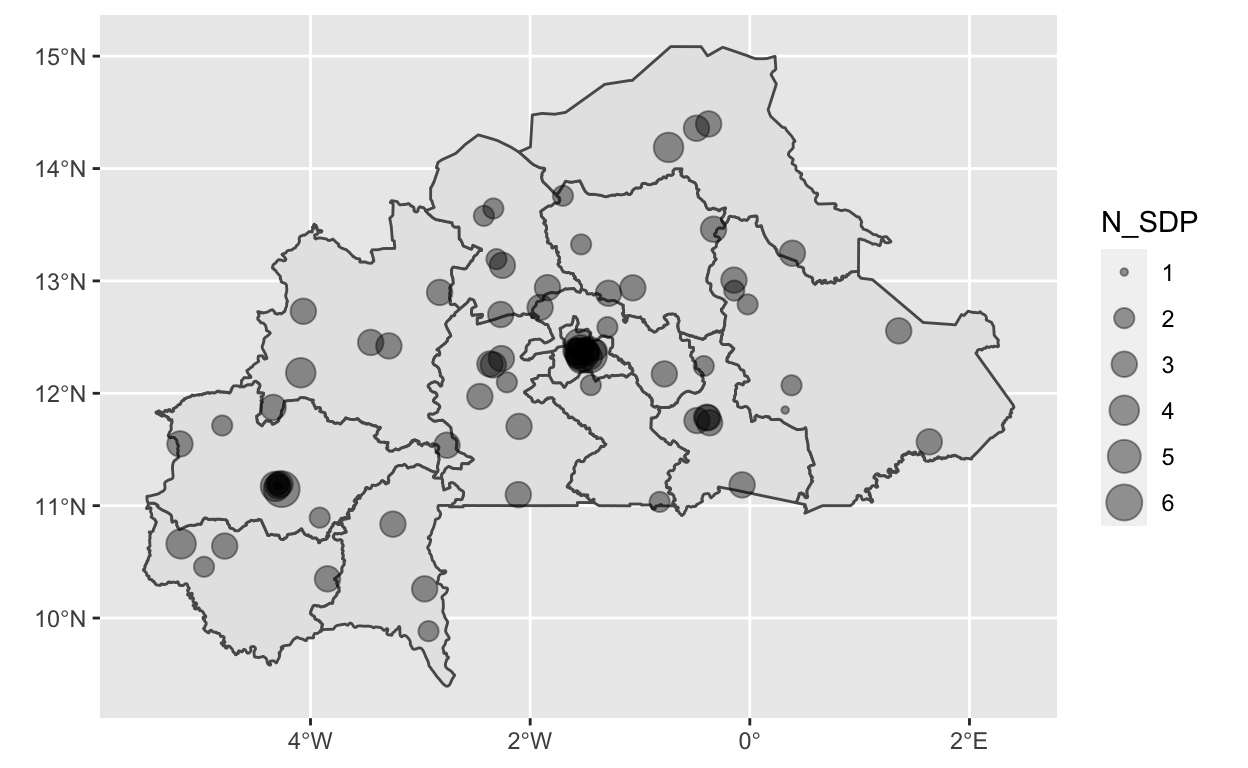
From the map, it looks like there may be a few locations where there EAs are both close together and served by many SDPs, which are likely in urban areas. For example, the capital of Burkina Faso, Ouagadougou, is in the center of the map where there are a number of EAs on top of each other. But, it’s a little hard to see the variation in size when there are so many values for N_SDP and so many EAs on top of each other. Let’s do two things to make this more readable. First, we’ll create smaller categories of the N_SDP variable, and second, we’ll map the URBAN variable to the color aesthetic.
bf_ea2017 <- bf_ea2017 %>%
  mutate(
    N_SDP_CAT = case_when(
      N_SDP <= 2 ~ 1,
      N_SDP >2 & N_SDP <= 4 ~ 2,
      N_SDP >4 ~ 3),
    N_SDP_CAT = factor(N_SDP_CAT,
                       levels = c(1, 2, 3),
                       labels = c("Low", "Mid", "High"),
                       ordered = T), # needs to be an ORDERED factor to map to the size aesthetic
    MEAN_OUTDAY = ifelse(is.na(MEAN_OUTDAY), 0, MEAN_OUTDAY),
    URBAN = factor(URBAN,
                   levels = c(0,1),
                   labels = c("Rural", "Urban"))
  )


# let's take a look at the distribution of this new categorical variable
bf_ea2017 %>%
  tab(URBAN, N_SDP_CAT)
Simple feature collection with 5 features and 5 fields
geometry type:  MULTIPOINT
dimension:      XY
bbox:           xmin: -5.18865 ymin: 9.883331 xmax: 1.634087 ymax: 14.39679
geographic CRS: WGS 84
# A tibble: 5 x 6
  URBAN N_SDP_CAT     N                        geometry  prop cum_prop
  <fct> <ord>     <int>                <MULTIPOINT [°]> <dbl>    <dbl>
1 Rural Mid          29 ((-5.18865 11.54962), (-4.3401…  0.35     0.35
2 Urban Mid          23 ((-5.178223 10.66001), (-4.781…  0.28     0.63
3 Urban Low          15 ((-4.307564 11.18051), (-4.299…  0.18     0.81
4 Rural Low          13 ((-4.969563 10.45619), (-4.804…  0.16     0.96
5 Urban High 3 ((-4.262726 11.14746), (-1.528… 0.04 1 ggplot() +
geom_sf(data = bf_shp) +
geom_sf(data = bf_ea2017,
aes(size = N_SDP_CAT,
color = URBAN),
alpha = 0.4) +
scale_color_viridis_d()
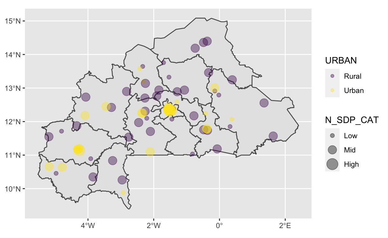
From this map we can see that urban areas are generally served by more SDPs – in fact, no rural EAs fall into the “High” category – although the difference is perhaps not as stark as one might have expected. But, what is the service environment like? Do urban areas have more stockouts than rural areas? Do SDPs in urban areas offer a greater selection of family planning methods? Did the service environment change between 2017 and 2018? Mapping can shed a lot of light on these questions.
Let’s look at the NUM_METHODS_PROV variable created in the last post. This variable captures the number of family planning methods provided by at least one SDP that serves a given EA.
bf_ea2017 %>%
  tab(NUM_METHODS_PROV) %>%
  arrange(NUM_METHODS_PROV)
Simple feature collection with 5 features and 4 fields
geometry type:  MULTIPOINT
dimension:      XY
bbox:           xmin: -5.18865 ymin: 9.883331 xmax: 1.634087 ymax: 14.39679
geographic CRS: WGS 84
# A tibble: 5 x 5
  NUM_METHODS_PROV     N                       geometry  prop cum_prop
             <dbl> <int>               <MULTIPOINT [°]> <dbl>    <dbl>
1                8     2 ((-4.299839 11.18039), (-2.96…  0.02     1
2                9    13 ((-4.340111 11.8743), (-4.281…  0.16     0.92
3               10    34 ((-5.18865 11.54962), (-4.969…  0.41     0.41
4               11    29 ((-5.178223 10.66001), (-3.84…  0.35     0.76
5               12     5 ((-2.757122 11.53829), (-2.26…  0.06     0.98
Since there is not a large range of number of FP methods provided, let’s dichotomize this so we can map it to the shape aesthetic.
bf_ea2017 <- bf_ea2017 %>%
  mutate(
    NUM_METHODS_CAT = case_when(
      NUM_METHODS_PROV <= 9 ~ 1,
      NUM_METHODS_PROV >9  ~ 2),
    NUM_METHODS_CAT = factor(NUM_METHODS_CAT,
                       levels = c(1, 2),
                       labels = c("Low (<=9)", "High (>9)"),
                       ordered = T)
  )


ggplot() +
  geom_sf(data = bf_shp) +
  geom_sf(data = bf_ea2017,
          aes(size = NUM_METHODS_CAT,
              shape = URBAN,
              color = NUM_METHODS_OUT3MO),
          alpha = 0.4) +
  scale_color_viridis_c()
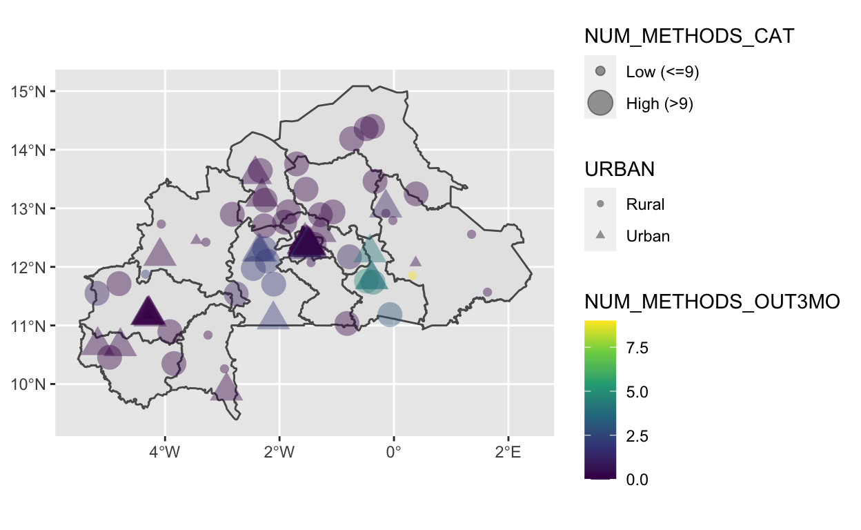
Putting it All Together
Now we have a map that shows spatial variation in availability of different methods of family planning and prevalence of stock-outs, as well as demonstrates how these characteristic differ across urban vs. rural EAs. It’s super quick to make a basic map like this, but let’s clean up a few things to make it look nicer.
ggplot() +
  geom_sf(data = bf_shp, fill = "#f2f2f5") +
  geom_sf(data = bf_ea2017,
          aes(size = NUM_METHODS_CAT,
              shape = URBAN,
              color = NUM_METHODS_OUT3MO),
          alpha = 0.4) +
  scale_color_viridis_c(direction = -1) + # reversing the direction makes the high #s stand out more
  labs(title = "Spatial Variation in Family Planning Service Environment",
       subtitle = "Burkina Faso 2017",
       caption = "Source: IPUMS PMA",
       shape = "",
       size = "Methods\nProvided",
       color = "Out of Stock\n(Past 3 Months)",
       x = NULL,
       y = NULL) +
  theme_minimal() +
  theme(
    axis.line = element_blank(),
    axis.text.x = element_blank(),
    axis.text.y = element_blank(),
    axis.ticks = element_blank(),
    axis.title.x = element_blank(),
    axis.title.y = element_blank())
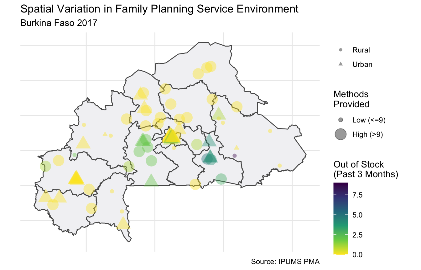
This map suggests there is spatial correlation to the stockouts – with 2 regions responsible for the majority of EAs with stockouts. It also looks like these EAs tend to have more methods provided by the SDPs that serve them. Finally, let’s use both years of data and see if there is any temporal variation. To do this, we’ll use the original bf_ea dataset (instead of sdp2017) and re-create the same NUM_METHODS_CAT factor variable that dichotomizes the NUM_METHODS_PROV variable. Then, we’ll use facet_wrap() to make a multi-panel plot, with one panel per year.
bf_ea <- bf_ea %>%
  mutate(
    NUM_METHODS_CAT = case_when(
      NUM_METHODS_PROV <= 9 ~ 1,
      NUM_METHODS_PROV >9  ~ 2),
    NUM_METHODS_CAT = factor(NUM_METHODS_CAT,
                       levels = c(1, 2),
                       labels = c("Low (<=9)", "High (>9)"),
                       ordered = T),
    YEAR = case_when(
      SAMPLE == 85405 ~ 2017,
      SAMPLE == 85408 ~ 2018
    ),
    URBAN = factor(URBAN,
                   levels = c(0,1),
                   labels = c("Urban", "Rural"))
  )

ggplot() +
  geom_sf(data = bf_shp, fill = "#f2f2f5") +
  geom_sf(data = bf_ea,
          aes(size = NUM_METHODS_CAT,
              shape = URBAN,
              color = NUM_METHODS_OUT3MO),
          alpha = 0.4) +
  facet_wrap(~ YEAR) +
  # reversing the direction makes the high #s stand out more
  scale_color_viridis_c(direction = -1) +
  guides(color = guide_colorbar(barheight = .75,
                                barwidth = 4.5,
                                label.position = "top",
                                label.hjust = 0)) +
  labs(title = "Spatial Variation in Family Planning Service Environment",
       subtitle = "Burkina Faso 2017-2018",
       caption = "Source: IPUMS PMA",
       shape = "",
       size = "Methods\nProvided",
       color = "# Methods\nOut of Stock\n(Past 3 Months)",
       x = NULL,
       y = NULL) +
  theme_minimal() +
  theme(
    axis.line = element_blank(),
    axis.text.x = element_blank(),
    axis.text.y = element_blank(),
    axis.ticks = element_blank(),
    axis.title.x = element_blank(),
    axis.title.y = element_blank(),
    legend.title = element_text(size = 8),
    legend.position = "bottom")
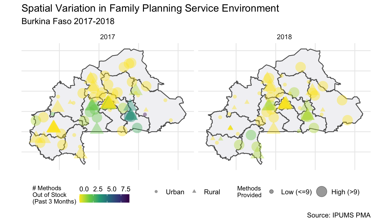
With the 2018 data included, it looks like the service environment may have improved between 2017 and 2018 with fewer stockouts. However, it also looks the EAs that faced more stockouts in 2017 are not always the same as those facing stockouts in 2018. But, there is still a spatial pattern to the stockouts in 2018. It also looks like some EAs had fewer family planning methods available from SDPs in 2018 than in 2017, specifically in the western part of the country.
Future posts may explore other supply-side factors that could influence the SDPs (and look at how these change over time) or examine demand-side factors by merging in the individual-level data.
As always, let us know what kinds of questions about fertility and family planning you’re answering – especially if you’re doing anything spatial!