Up to this point, this blog has used R to demonstrate spatial processing and analysis techniques. We’ve emphasized some of the benefits of using R, but it’s far from the only software available for spatial processing. Many spatial analysts instead rely on dedicated GIS (Geographic Information Systems) software, which provide a point-and-click interface for performing spatial analysis workflows.
In this post, we will use the open-source GIS software QGIS (Quantum GIS) to integrate environmental data with health survey data. Using a case study from Kenya, we will combine monthly temperature data from CHIRTS with geolocated sample clusters from the Demographic and Health Surveys Program (DHS). If you’ve been following along with this blog, you’ll recognize some similarities between this post and previous posts. But while the spatial analysis techniques will be familiar, the tools we use to implement them will be new.
This step-by-step guide will provide an overview of QGIS and show you how to import data, process raster data, create spatial buffers, and extract aggregated data for analysis.
Getting started with QGIS
QGIS is a powerful GIS software that allows us to visualize, analyze, and edit spatial data. QGIS is an ideal choice for beginners and advanced users alike because it combines a user-friendly interface with powerful spatial processing capabilities. As is the case with R, QGIS is open-source, meaning countless community resources, plugins, and tutorials are available for new learners. This makes it a particularly accessible and versatile tool for spatial analysis.
Download and install QGIS
Follow the instructions on the QGIS download page to download the appropriate QGIS version for your operating system. You have the option to select the Long Term Version for stability or the Latest Version to gain access to the newest features and updates.
The QGIS interface
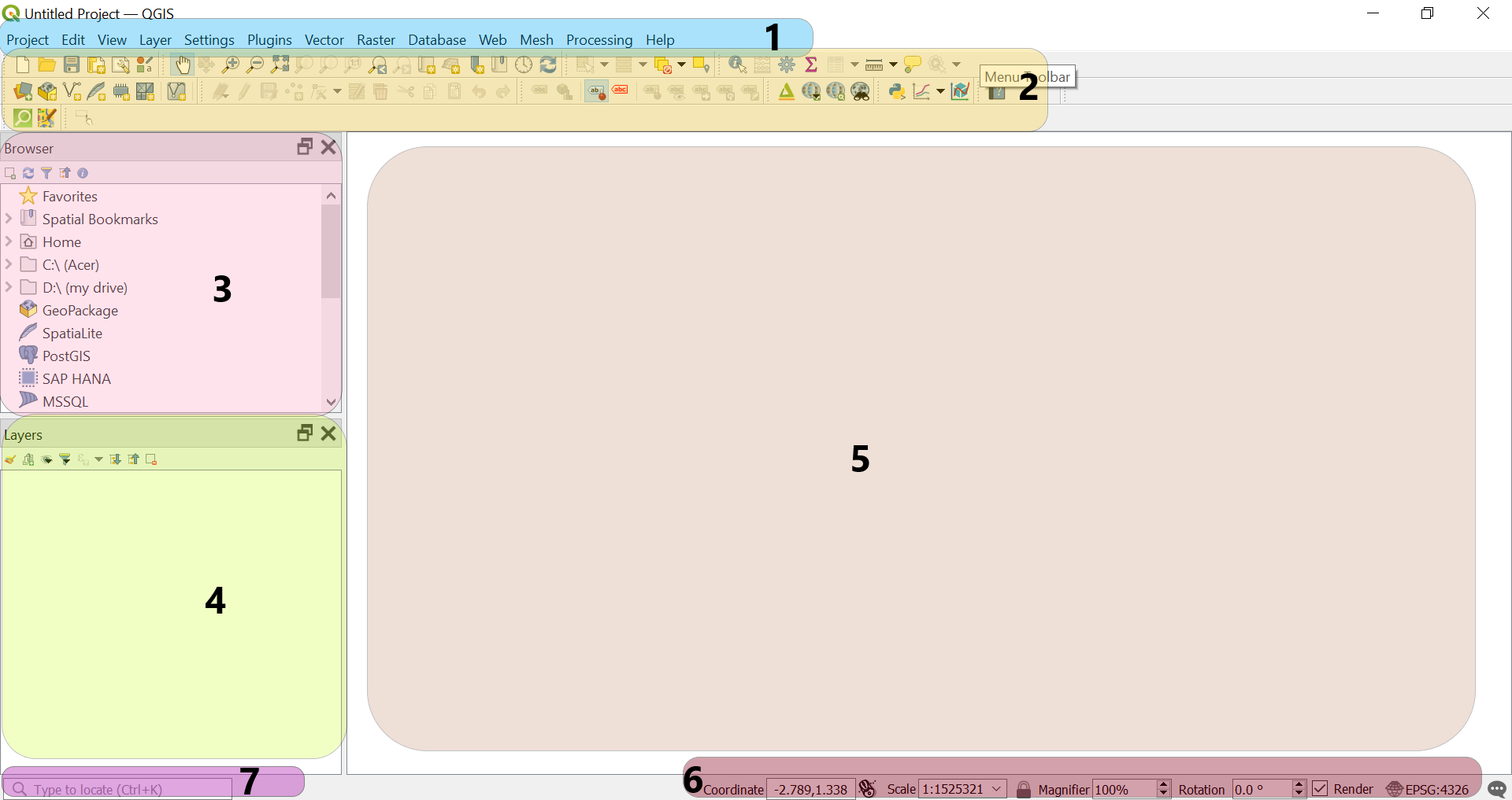
Once QGIS is installed, you’re ready to explore its interface and tools. Figure 1 shows a screenshot of the main QGIS interface with some of the main components highlighted.
Menu Bar: Located at the top of the interface, the Menu Bar provides access to all functions and tools within QGIS, organized into categories like Project, Edit, View, Layer, Raster, Vector, Settings, etc. This is where we can access more advanced features, adjust settings, and manage our workspace.
Toolbar: Directly below the Menu Bar, the Toolbar contains icons for many of the most frequently used tools in QGIS. Here, we’ll find quick access to functions like adding layers, zooming in and out, saving our project, and using geoprocessing tools. Each icon corresponds to a specific function, making it easy to perform actions without needing to navigate through menus.
Browser: The Browser panel on the left helps us quickly access files and databases on our computer or connected servers. It’s similar to a file manager, allowing us to drag and drop data directly into the Map Window. If it’s not visible, you can enable it by selecting in the toolbar.
Layers Panel: The Layers Panel displays all the spatial layers that we’ve added to our current QGIS project. Each layer represents a different data source (e.g., country boundaries, temperature data, or health survey points). We can control the visibility of each layer, reorder them (by directly dragging them up or down), and change their styles directly from this panel. Right-clicking on a layer gives us additional options like opening the attribute table or adjusting the symbology. The visibility of layers on the Map Window depends on their position in this panel—make sure to keep the layer you want to visualize on top.
Map Window: The Map Window is the central area where our spatial data is visually displayed. As we add, modify, and analyze data, the results are shown here. We can zoom in, zoom out, and pan across different parts of our map using tools from the toolbar or our mouse.
Information Bar: At the bottom of the QGIS window, the Information Bar displays details about our current map view, including coordinates, scale, magnification level, and active CRS (Coordinate Reference System). It’s helpful for ensuring accurate spatial alignment and for referencing the precise location of our map elements.
Search Bar: The Search Bar (or Locator Bar) allows us to quickly find tools, layers, and functions within QGIS. We can type in keywords like “Buffer” or “Raster Calculator” to access specific tools or commands without having to navigate through multiple menus. This feature speeds up our workflow and is especially useful for beginners still familiarizing themselves with the software.
Spatial data sources
For this analysis, we’ll need three spatial datasets. We’ve created a project folder called Kenya_Temperature_Analysis to store these files. To follow along, we suggest you create a similar directory to store all the spatial data files used in this demo.
Kenya boundary data
This vector shapefile contains the administrative boundaries of Kenya. This will be useful as a reference layer for clipping and other spatial operations. We’ll need boundaries for the level-0 administrative boundary—that is, the country’s border.
There are a variety of resources available to obtain administrative boundary data. In the past, we’ve download data from the DHS Spatial Data Repository. For this post, we’ve decided to download our data from the Database of Global Administrative Areas (GADM) website because it provides level-0 data directly.
From the GADM website, select “Kenya” in the country drop-down and download the border data in shapefile format. This will provide a compressed folder containing multiple files (e.g., .shp, .dbf, .shx, .prj) that are essential for the shapefile to function correctly in GIS software. The file may be compressed, so be sure to extract all files into the same directory, as QGIS requires them to be together for proper rendering. Save this extracted folder under your overall project folder.
Temperature raster data
We’ve introduced CHIRTS in previous posts, but so far we’ve always used daily data. To simplify things for this post, we’ll use the CHIRTS monthly data product instead.
We’ll use monthly maximum temperature (Tmax) data for 2016, which you can download from the CHIRTS website. Each file represents the maximum temperature for a specific month from January 2016 (CHIRTSmax.2016.01.tif) to December 2016 (CHIRTSmax.2016.12.tif) These files will allow us to calculate the 2016 annual average maximum temperature.
Once you’ve downloaded these files, you’ll want to put them in their own sub-directory within your project. In our case, we’ve called this directory CHIRTS.
DHS cluster data
As we’ve done in many posts, we’ll use geolocated DHS cluster coordinates to identify the displaced locations of DHS sample clusters for Kenya.
As we’ve described before, to obtain the GPS coordinates for a specific sample, you’ll have to log into your DHS Program account. Specify the country of interest (Kenya, in this case), and, on the line for the appropriate sample year (we’re using the 2022 sample for this demo), click the link to download the GPS coordinate data under the GPS Datasets heading.
As always, you’ll need to have a registered DHS project to download data for these cluster coordinates. If needed, you can always use the workflow from this demonstration with data from another DHS sample and area if you haven’t requested permission for Kenya samples specifically.
You’ll be presented with a new page containing a list of download links. Scroll down to the Geographic Datasets section. Download the file listed as a shapefile (.shp).
Once downloaded, save the shapefile into a sub-folder under your project folder to keep everything organized. For the 2022 sample, the downloaded file name should be KEGE8AFL.shp.
Importing and organizing spatial data in QGIS
Preparing our project
Before we can begin, we need to initiate a QGIS project to store our work and add the data sources identified above to our project.
1. Create a new QGIS project
Open QGIS and create a new project by navigating to .
Save the project by navigating to . Provide a project name (in our case, we’ve used Spatial_Analysis_Kenya.qgz) and select the designated project folder we created previously (Kenya_Temperature_Analysis). Saving the project file ensures we can pause and resume our work without losing progress.
2. Add the temperature raster data
Select . Navigate to the CHIRTS sub-folder within our project folder and select all the monthly raster files (CHIRTSmax.2016.01.tif to CHIRTSmax.2016.12.tif). Click to load the rasters into QGIS.
3. Add the Kenya shapefile
Go to . Browse to the Shapefiles sub-folder and select the Kenya boundary shapefile (If you downloaded from GADM, the file should be named gadm41_KEN_0.shp). Again, click to add the shapefile to our QGIS project.
4. Load the DHS cluster data
Go to to import the DHS cluster shapefile (‘KEGE8AFL.shp’). Click .
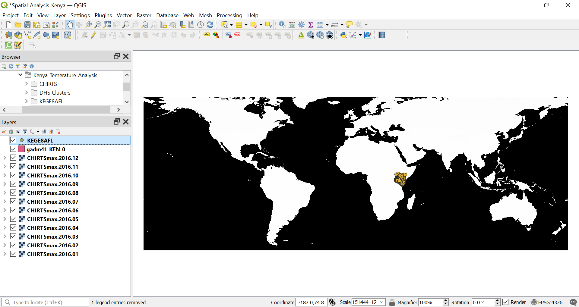
At this point, your interface should look something like Figure 2:
Organizing and visualizing layers in QGIS
When we import data into QGIS, it is represented in its raw form and at its full spatial extent (as in Figure 2). To make sense of this data and facilitate analysis, it’s crucial to understand some basic organizing and visualizing tools within QGIS. These tools help us manage the appearance and arrangement of layers, ensuring that the data is clear and easy to interpret.
Layer visibility and order
Layers in QGIS are displayed based on their order in the Layers Panel. Make sure that the DHS cluster shapefile is on top, followed by the Kenya boundary shapefile, and then the raster layers. This will help maintain a clean and visible map. You can reorder layers by dragging them up or down within the Layers Panel.
Zoom to layer
After adding layers, it’s useful to zoom in on specific layers for better visualization:
- Right-click on a layer in the Layers Panel and select .
- This adjusts the map view to focus on the full extent of the selected layer, making it easier to work with your data.
If you lose track of your map (which happens often in QGIS!), using can quickly help re-center the view on any specific dataset.
Working with coordinate reference systems
We’ve mentioned coordinate reference systems in previous posts. As was the case there, it’s worth confirming the CRS of the layers in QGIS to ensure that we’re conducting the expected spatial operations. To check the CRS of a layer:
- Right-click on any layer (e.g., the Kenya shapefile or DHS clusters) and select .
- In the tab, check the CRS of the layer, shown as an EPSG code (e.g., EPSG:4326 for WGS 84).
QGIS also sets a project-wide CRS, which is used for on the fly projection. To check or change the CRS of the project, click on the CRS displayed in the bottom-right corner of the QGIS window. Make sure that the project CRS matches the CRS of your layers for consistent spatial alignment.
While you’re working, QGIS projects layers “on the fly”. That is, if you have layers in different reference systems, QGIS will visualize them in the single project CRS so that the layers align visually. However, this doesn’t actually project any layer’s data to a new CRS. Thus, for spatial analysis, you’ll want to double check to ensure each layer is in an appropriate CRS for the operations you’re conducting.
Change the CRS of the DHS cluster point shapefile
As we’ve discussed before, we need to project our cluster points before we can buffer them, as we want to buffer in units of meters, not degrees. For Kenya, an appropriate projection is UTM zone 37S (EPSG:32737).
Refer to EPSG.io to identify the EPSG code for a given projection and for help identifying projection properties.
There are two ways to reproject the vector layer in QGIS:
Method 1: Export the layer
- Right-click the DHS cluster layer (
KEGE8AFL) - Select
- In the section, choose the appropriate UTM projection. In our case, we will use zone 37S. Provide a simple name to the reprojected shapefile (e.g.,
Clusters.shp) and save.
- Right-click the DHS cluster layer (
Method 2: Reproject via Data Management
- Navigate to
- In the window that opens, select the DHS cluster layer as the
- Choose the appropriate UTM projection (again, UTM 37S in our case) in the section.
- Click to complete the reprojection. By default this creates a temporary layer, but you also have the option to specify an output file.
Symbology and visualization
Symbology refers to the visual representation of our data on the map. We can adjust symbology to make for a more interpretable and visually appealing map.
Right-click on the Kenya shapefile and select .
Choose Outline: Simple Line in the field to help distinguish the boundary from the background raster layers. Feel free to explore other symbology options to familiarize yourself with the interface. Click to periodically apply changes to the map, and when you’re satisfied.
For the DHS clusters, use a Simple Marker layer type to mark each point clearly on the map. Play around with colors, strokes, and line weights until you’re satisfied and click .
For our CHIRTS data, change the to singleband pseudocolor. You can select from several pre-made color ramps or design your own by clicking the drop-down arrow. In our case, we’re using the Spectral color ramp.
You’ll also want to change the option to something much greater than -9999 (we’re using -10 for now). By default, the raster color scheme will use the full range of the data and expand to accommodate extreme values like -9999, which represent “no data” areas. This distorts the color scale. Adjusting the minimum and maximum values allows for better visual representation and more accurate analysis of the data.
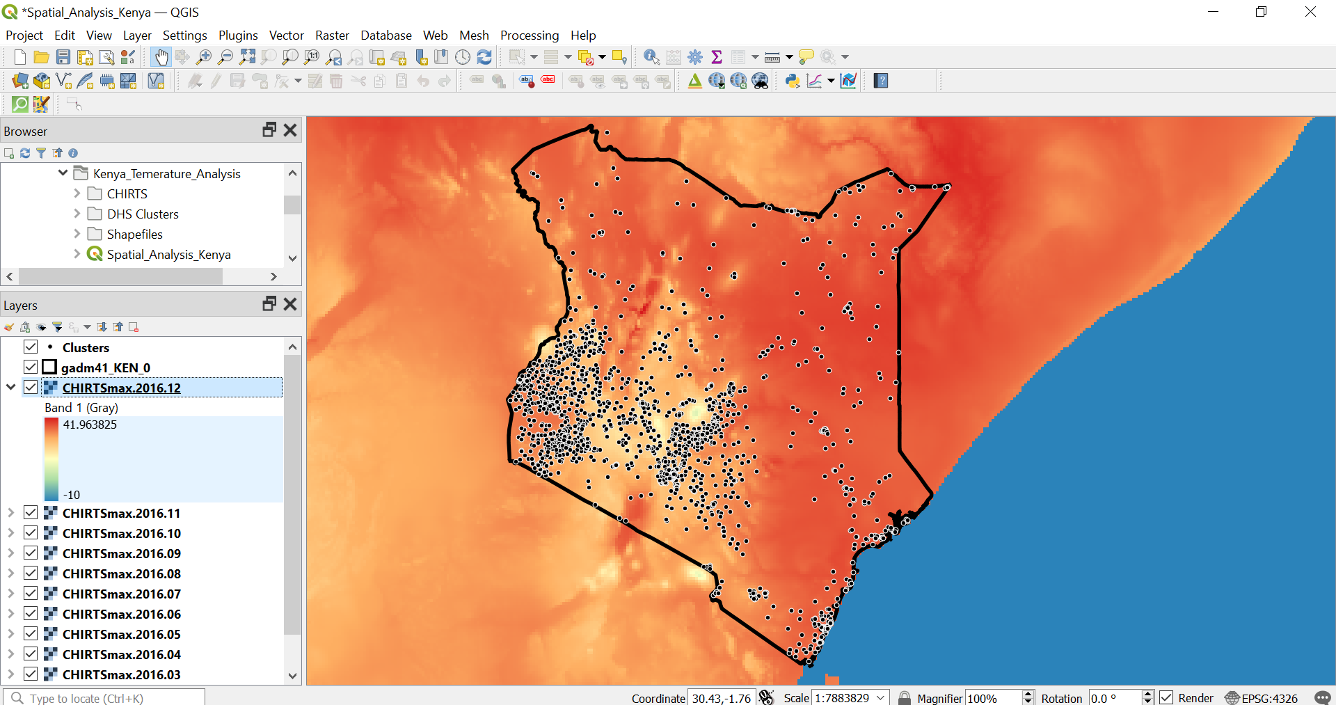
Figure 3 presents an example QGIS interface after applying the organization and visualization techniques discussed. It’s okay if your symbology looks a little different from ours. We recommend that you take the time to explore the available symbology options, as they offer interesting ways to enhance your data presentation and analysis.
Geoprocessing in QGIS
Temporal aggregation using raster calculator
Since we have 12 raster layers representing monthly maximum temperatures (Tmax) for the year 2016, we can perform temporal aggregation by averaging these layers.
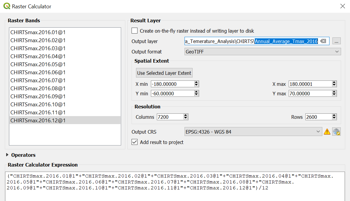
In this example, we will calculate the annual average Tmax for 2016. Navigate to . In the calculator window, we need to enter the formula to calculate the average from each of the 12 raster bands. To do so, you can double click on each raster band in the selection pane to bring it in the expression bar. To add addition and division operators, you can type them directly into the expression bar or add them from the drop-down panel.
You should end up with an expression in the expression bar that looks like the one shown in the box shown in Figure 4. This formula sums the values from all 12 months and divides by 12 to obtain the average temperature for the year. Name the output file as Annual_Average_Tmax_2016.tif and save it in an appropriate folder within your project directory (Figure 4). We can keep the defaults for the other options.
After selecting a file location, the raster calculator window may disappear behind the main QGIS window. Be sure to find this window and officially run the process, or it will appear as if nothing has happened!
This may occur with other geoprocessing tools as well.
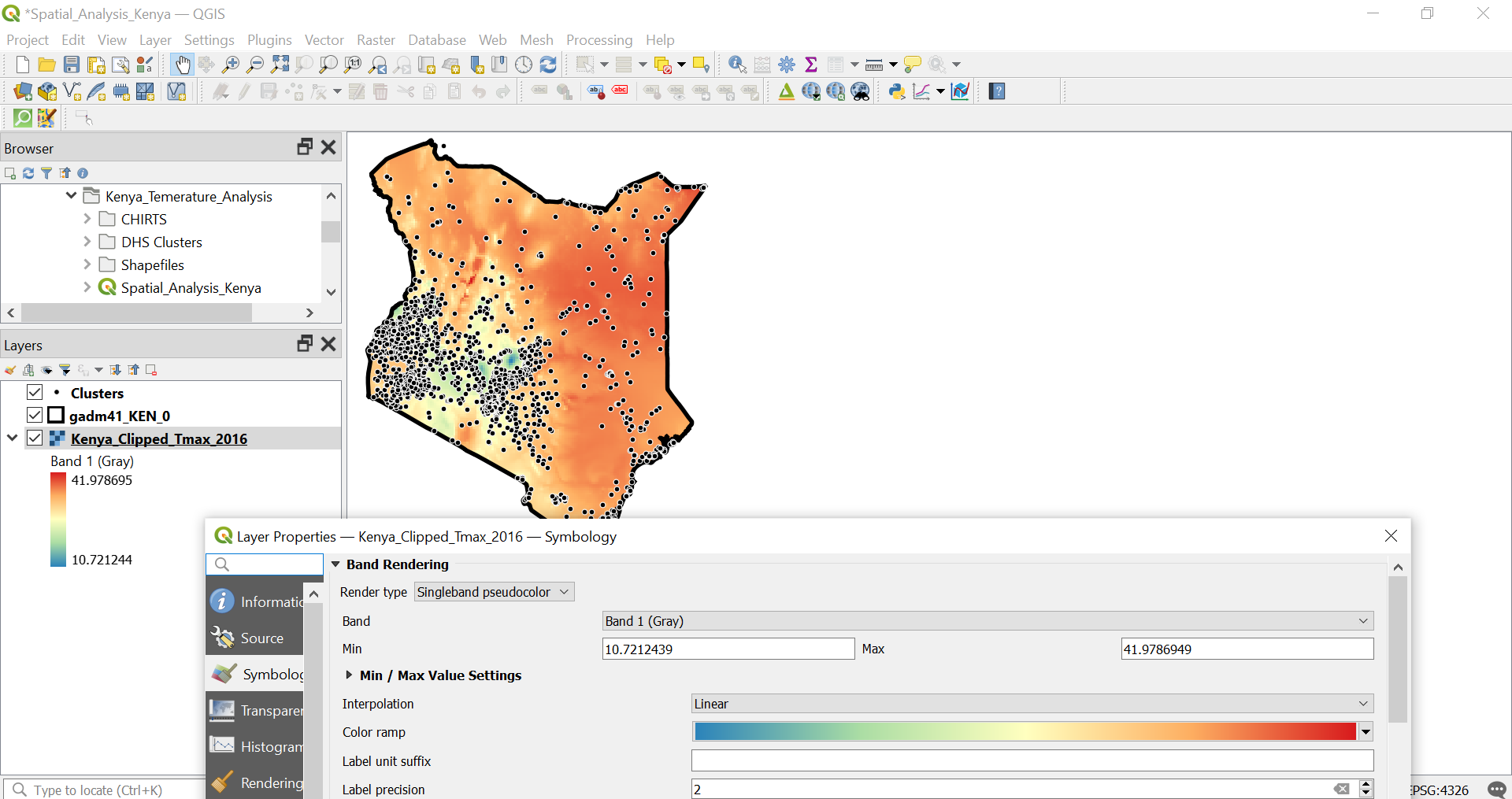
The new raster will appear as a new layer in our Layers Panel, and you can apply the same singleband pseudocolor scheme for visualization to better interpret the temperature data. We can remove the single-month files from QGIS to keep things tidy (right click on the single-year layers and select ).
Clipping raster to the area of interest
Clipping the raster to the Kenya boundary is important because it ensures that our analysis is focused only on the area of interest, eliminating unnecessary data from outside the country’s borders and reducing file size for better processing.
To perform this task, we will follow a simple process in QGIS. First, we will navigate to .
In the window that appears, we will set the to the newly generated annual average raster (Annual_Average_Tmax_2016.tif). Then, for the , we will select the Kenya boundary shapefile (gadm41_KEN_0.shp). This ensures that the raster is clipped to the boundaries of Kenya. Finally, we will name the output file as Kenya_Clipped_Tmax_2016.tif and save it in the CHIRTS folder (Figure 5).
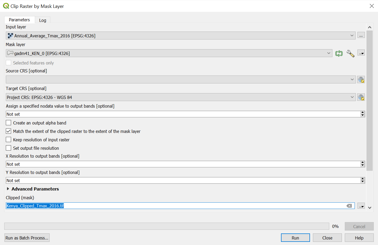
After the process is complete, we will have a new raster that only covers the extent of Kenya, ready for further analysis. We can remove the full extent raster file from the layer panel and use the singleband pseudocolor scheme for better visualization. Notice that the minimum value in this case is already accurate as we do not have missing data within this clipped raster (Figure 6).
Buffering DHS cluster points
Creating buffers around point locations is crucial for spatial analysis because it allows us to define areas of influence or impact around each point, enabling more focused environmental or demographic analysis. In this post as in previous ones, we are interested in creating buffers around the point locations of the geolocated DHS clusters.
To create buffers, we will go to . In the window that opens, we will set the to be the reprojected DHS cluster file. Next, we will specify a buffer distance of 10,000 meters, which creates a 10 km zone around each cluster point. Finally, we will save the output as DHS_10km_Buffers.shp in the Shapefiles folder (Figure 7). Once this process is complete, we will have buffer zones around the DHS clusters, ready for further spatial analysis and extraction of environmental data.
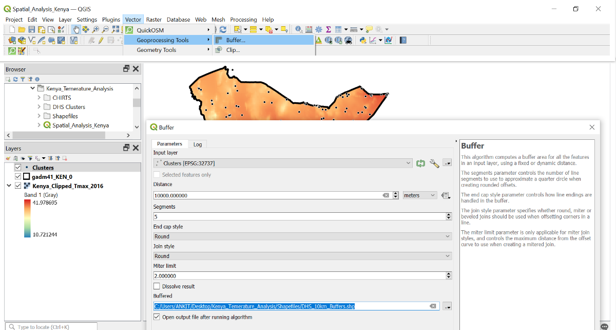
If you haven’t successfully reprojected the cluster location shapefile, you won’t be able to buffer in meters. Double check the CRS of the layer as described previously and ensure that the layer has been projected to UTM coordinates.
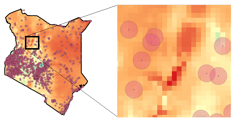
As with other layers, we can adjust the symbology of the buffer regions (e.g., to decrease opacity) by right clicking the layer in the pane and selecting .
Using the tool in the bottom right, we can zoom into specific areas to inspect parts of the map without changing the overall map scale, which helps in closely examining details (Figure 8).
Aggregating raster values
Extracting environmental data at aggregated levels, such as within buffer zones, allows us to quantify environmental conditions (in this case, temperature) in specific areas. This process helps in identifying patterns and relationships between environmental factors and outcomes in defined regions and their populations.
We are interested in aggregating buffer-level Tmax statistics. To aggregate the data, go to .
If you can’t find a tool, you can always search for it in the search bar. For instance, a search for “Zonal statistics” would reveal where the tool is located.
In the window that opens, set the to DHS_10km_Buffers.shp and the to Kenya_Clipped_Tmax_2016.tif. Set the to "Tmax_". Under , choose Mean to compute the average temperature for each buffer based on the raster pixels within that buffer. Save the file in the Shapefile sub-folder with the name Mean_Tmax_buffer.shp (Figure 9).
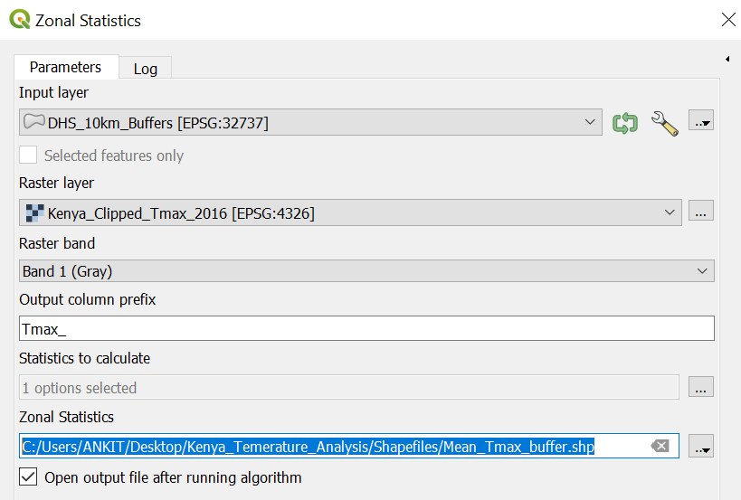
With this, we now have a new shapefile that includes a new column (Tmax_mean) in the buffer layer’s attribute table, representing the mean temperature for each buffer zone (Figure 10). You can verify this by opening the attribute table (right-click on the new layer and select ). To export the attribute table as a CSV file, right-click on the layer, go to , or save it in another tabular format. It is crucial to keep the unique cluster ID (DHSID) linked to the extracted data for easy reference and further analysis.

Conclusion and next steps
With the extracted environmental data for each DHS cluster, you now have a powerful dataset that can be linked to a wide range of health and demographic variables available in DHS surveys. This integration can reveal patterns that might not be visible through traditional analysis, providing a more nuanced understanding of how environmental factors interact with population health and social variables.
By incorporating other spatial data sources—such as additional environmental variables or socioeconomic indicators—you can build a more comprehensive picture of the contextual factors influencing health outcomes. This type of spatial analysis opens up opportunities for advanced research, allowing you to explore environmental determinants and inform targeted strategies for improving population health and well-being.
While this post just barely scratches the surface of the functionality available with QGIS, it can serve as a starting point for you to keep exploring and learning about the other features the software has to offer.
Additional Resources
- QGIS Documentation
- DHS Blog post discussing linking extreme weather data for use in health research.
- Detailed Tutorial Video on IUSSP’s YouTube Channel
- GPS data collection and random displacement in DHS
Getting Help
Questions or comments? Check out the IPUMS User Forum or reach out to IPUMS User Support at ipums@umn.edu.
Acknowledgments
Special thanks to Finn Roberts, Senior Data Analyst at IPUMS, for assistance in editing and reviewing this post.
